jqxGrid is powerful datagrid widget built entirely with open web standards. It offers
rich functionality, easy to use APIs and works across devices and browsers. jqxGrid
delivers advanced data visualization features and built-in support for client and
server-side paging, editing, sorting and filtering.
Highlights
- Works across devices and browsers
- Web Standards Compliant
- Rich and easy to use JavaScript API
- Optimized for Performance
- Easy customization and built-in themes
- Localization
Features
- Data Binding
- Outlook-Style Grouping
- Sorting
- Filtering
- Paging
- Editing and Validation
- Nested Grids
- Row Details
- Localization
- Column Types
- Columns Resizing
- Columns Reorder
- Columns Hierarchy
- Pinned Columns
- Foreign Columns
- Cells Formatting
- Custom Cells Rendering
- Custom Cell Editors
- Rows and Cells Selection
- Aggregates
- Export to Excel, XML, HTML, CSV, TSV and JSON
- Keyboard Navigation
- State Maitenance
Great Performance
jqxGrid offers an intuitive and easy-to-use interface for common data interaction
features such as grouping, sorting, filtering, paging, and scrolling. The rows and
columns support full UI virtualization which minimizes the number of DOM elements
that need to be rendered and ensures unbeatable performance in scenarios with thousands
of rows and columns.
Data Binding
jqxGrid has a built-in data binding logic designed to support various data sources
and operate with large datasets. The grid supports several data binding modes optimized
for common scenarios:
- Local Data - load the data grid from a local array of objects.
- Xml Data - load the data grid from XML data source using AJAX.
- JSON Data - load the data grid from JSON data source using AJAX.
- CSV Data - load the data grid from CSV.
- Tab Data - load data grid from Tab-Delimited (TSV).
- Remote Data - load the data grid using JSONP. JSONP (JSON with Padding) represents
JSON data wrapped in a function call. JSONP is an effective cross-domain communication
technique frequently used to bypass the same-origin policy limitations.
- Virtual Data - jqxGrid can be populated with data on demand when the user scrolls
or changes the current page.
Outlook-Style Grouping
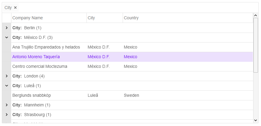
jqxGrid widget enables users to group data with simple drag and drop. Users can
also rearrange the grouping hierarchy by dragging and dropping the grouping headers
in the group panel.
Sorting
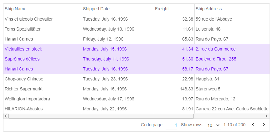
jqxGrid provides built-in powerful sorting capabilities like one-click automatic
sorting, selection of sort option from a context menu and sorting through API calls.
The data grid automatically chooses the most appropriate comparison. Users can also
implement and use a custom sort comparer functions. The sorting works well with
all possible configurations including rows grouping and paging.
Paging
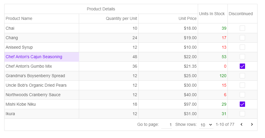
The integrated paging functionality lets the users display large data sets in multiple
pages for faster loading and easy navigation. Users also have an option to select
how many records to display in a page.
Nested Grids
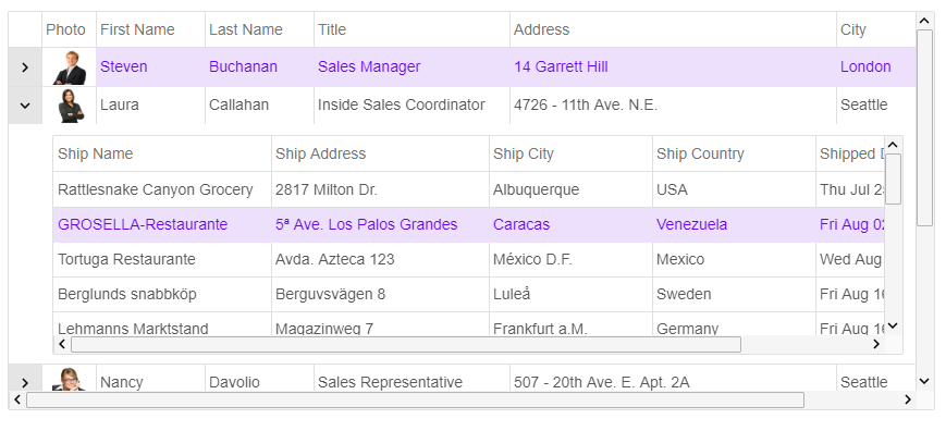
jqxGrid has a very flexible layout that enables easy nesting of any content, UI
elements and widgets including nested data grids.
Row Details
Row details are built-in feature of the data grid. You can change the height of
the row details area and use custom data templates. You can also use JavaScript
APIs to expand and collapse the grid row details area.

Column Types
The infrastructure of jqxGrid is designed to support multiple column types. In the
current version the data grid provides built-in 'Text', 'Number', 'DropDownList',
'DateTime' and 'CheckBox' columns. Our jQuery grid also supports custom data rendering.
Developers can easily replace the default rendering logic and use custom columns
and cells rendering.

Pinned Columns
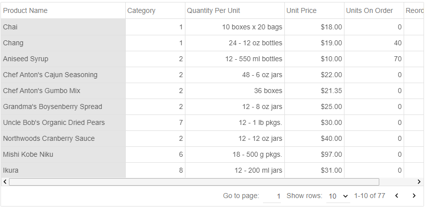
jqxGrid supports Excel-like pinned (frozen) columns. This feature also allows you
to pin columns to the left the gridview's canvas. The pinned columns are very useful
when working with large tables and it makes it easy to scroll and compare data from
different parts of the table.
Cells Formatting
Our jQuery grid offers a cell formatting feature where you can easily specify a
formatting string for grid column. You can format dates, numeric values like decimal
numbers, integer and floating-point numbers, currency and percentage values.
Custom Cells Rendering
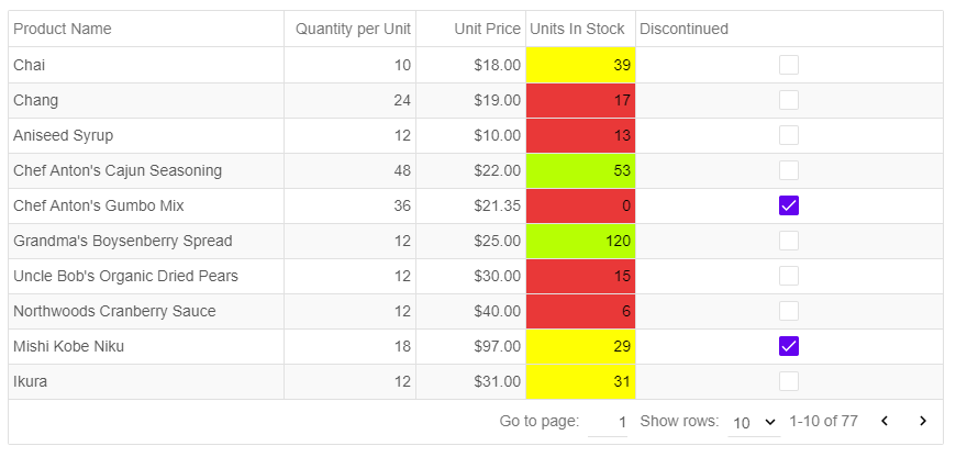
The data grid programming model is very flexible and extensible. Developers can
create custom cell rendering functions and apply them to columns or individual grid
cells. This feature technically enables rendering of any HTML content in the grid
cells.
Localization
Our jQuery grid supports localization for multi-language web sites and applications.
All text elements used in control buttons, menu items and elements can be localized.

Keyboard Navigation
If the user starts typing text, the cell's content is replaced with the text entered
from the user.
- Left Arrow key is pressed - Selects the left cell, when the Grid is not in edit
mode. Otherwise, the key stroke is handled by the editor.
- Right Arrow key is pressed - Selects the right cell, when the Grid is not in edit
mode. Otherwise, the key stroke is handled by the editor.
- Up Arrow key is pressed - Selects the cell above, when the Grid is not in edit mode.
Otherwise, the key stroke is handled by the editor.
- Down Arrow key is pressed - Selects the cell below, when the Grid is not in edit
mode. Otherwise, the key stroke is handled by the editor.
- Page Up/Down is pressed - Navigate Up or Down with one page, when the Grid is not
in edit mode. Otherwise, the key stroke is handled by the editor.
- Home/End is pressed - Navigate to the first or last row, when the Grid is not in
edit mode. Otherwise, the key stroke is handled by the editor.
- Enter key is pressed - Shows the selected cell's editor. If the cell is in edit
mode, hides the cell's editor and saves the new value. The editor's value is equal
to the cell's value.
- Esc key is pressed - Hides the cell's editor and cancels the changes.
- Tab key is pressed - Selects the right cell. If the Grid is in edit mode, saves
the edit cell's value, closes its editor, selects the right cell and opens its editor.
- Shift+Tab keys are pressed - Selects the left cell. If the Grid is in edit mode,
saves the edit cell's value, closes its editor, selects the left cell and opens
its editor.
- F2 key is pressed - shows the selected cell's editor when the Grid is in edit mode.
- Space key is pressed - Toggles the checkbox editor's check state when the selected
cell's column is a checkbox column and the Grid is editable.
- Ctrl key is pressed - in 'multiplecellsextended and multiplerowsextended' selection
mode, extends the selection when the user clicks on a cell or row.
- Ctrl+ARROW KEY - moves to an edge.
- SHIFT+ARROW KEY extends the selection.
- Page Down - Moves one screen down
- Page Up - Moves one screen up
- Home - Moves to the beginning
- End - Moves to the end
Styling and Customization
jqxGrid ships with multiple professionally designed themes. Each theme is stored
in a separate CSS file and is easy to change. The themes can be switched using a
single property of the grid widget.